Wednesday, July 2, 2008
Final Movie
The journey from start to finish on this video was exhausting... I spent about 4 or 5 hours just trying to find a computer that would function... oye. Once I started to play, though, I found that the idea for the movie came easily. I had the original idea to combine two movie trailers ("Swing Vote" and "The Lord of the Rings: Return of the King"), and to have a theme cautioning against power driving it. The end result was exactly what I was looking for, audio and all-- the beginning was humorous and intense, followed with a dramatic ending.
The font I used was actually found online-- it is called Hobbiton something-or-other: perfect for this piece. The transitions were used to make the viewer feel disoriented in the state of chaos created by power: not only in a fantastical world where evil reigns, but in the more subtle world of reality in which elections are thrown out of proportion. Even though the individual citizen does have power-- and like the character, maybe too much power-- the manipulation of elections by the media and political parties can often leave anyone feeling disenchanted with the distribution of power that is necessary in every society. Anyhow, it was intense but fun to create!
Final Animation
This animation was very fun to create, but took quite a while. The trickiest part of Photoshop animation is re-selecting all of the different elements of collective slides and arranging them in whatever order they need to be in on certain frames. Layers are my friend, but they can certainly be selfish with my time... heh.
I based the title off of the song that I played with and altered, "Nine Lives" by Aerosmith. It was fun to create different adventures for my little "Felalien". Goofy, cheesy, and silly, I still rather like this animation nonetheless. :-)
Enjoy!
Tuesday, July 1, 2008
In-Design Tutorials
http://www.video-tutes.com/player/player.php?id=1547&T_id=8
For InDesign tutorials, I discovered the above website. I found that Adding pages, Photoshop clipping path, and Linking text boxes were particularly helpful, especially when it came to utilizing InDesign for book publishing-related reasons. The layout was particularly interesting because it sets up the viewer in an InDesign document, following the steps necessary to complete whatever task is at hand, but there is no sound, making it awkward for the beginning user.
http://www.docnmail.com/learn/indesign.htm
This is another silent tutorial, but is situated for Windows users. I think it is particularly helpful for non-Mac, first-time users of InDesign. :-)
In my search, there appeared to be more tutorials which cost money. I would imagine this is because of the need for InDesign and its all-around versatility to be used by everyone.
Photoshop Tutorials
Upon exploring the internet, I've found some pretty interesting tutorials. They are listed below:
http://photoshoptutorials.ws/photoshop-tutorials/photo-manipulation/fashion-shot.html
This site is a great reference for anyone who may be going into the fashion industry. It brings the reader step-by-step through the composition of the fashion image below. While the steps reminded me of some basic aspects of Photoshop like layers, opacity and gradients, it illustrated how these basic elements can be used to create a completely unique photograph.

http://www.photoshoproadmap.com/Photoshop-tutorials
This website is overall a great resource. It illustrates how to create many different images which would be extremely useful in advertising projects. For example, the following website shows with image-by-image example how to create a sweet background and atmosphere for a phone commercial. These tutorials are so straightforward that anyone with hardly any experience with Photoshop would certainly be able to create great images. http://www.tutzor.com/index.php/2008/06/sleek-phone-advertisement-flyer/
http://www.photoshopstar.com/
This website is an entire community for Photoshop junkies. There are contests, places to post creations and to glean from others the steps/objects they used to create special textures and images. Though there aren't specific tutorials, these resources would be great for a beginner or a seasoned pro at the program.
http://photoshoptutorials.ws/photoshop-tutorials/photo-manipulation/fashion-shot.html
This site is a great reference for anyone who may be going into the fashion industry. It brings the reader step-by-step through the composition of the fashion image below. While the steps reminded me of some basic aspects of Photoshop like layers, opacity and gradients, it illustrated how these basic elements can be used to create a completely unique photograph.

http://www.photoshoproadmap.com/Photoshop-tutorials
This website is overall a great resource. It illustrates how to create many different images which would be extremely useful in advertising projects. For example, the following website shows with image-by-image example how to create a sweet background and atmosphere for a phone commercial. These tutorials are so straightforward that anyone with hardly any experience with Photoshop would certainly be able to create great images. http://www.tutzor.com/index.php/2008/06/sleek-phone-advertisement-flyer/
http://www.photoshopstar.com/
This website is an entire community for Photoshop junkies. There are contests, places to post creations and to glean from others the steps/objects they used to create special textures and images. Though there aren't specific tutorials, these resources would be great for a beginner or a seasoned pro at the program.
Monday, June 23, 2008
Midterm-- Newsletter


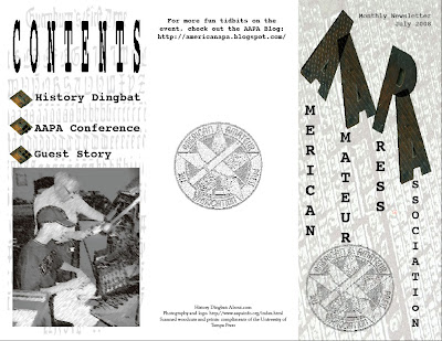
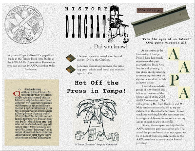
Instead of making a food menu, I decided to create a newsletter. On June 13th, I attended and worked at the AAPA (American Amateur Printing Association) Convention held here in Tampa. As a student staff assistant at the University of Tampa Press, I helped the convention run smoothly while also learning a great deal about the art of letterpress printing. The group is currently creating a post-convention newsletter, so I thought I would create my own! The main page is first, with a background for texture. Inside, I balanced scanned images from the convention with text and logos. The front incorporates a few different textured backgrounds: the contents page is a typographic recreation of Gutenburg's type and the other is of an entire font type. It turned out well, and perhaps the other AAPA members will agree :-)
Wednesday, June 18, 2008
Maximal Poem
Subscribe to:
Comments (Atom)


1.jpg)