Monday, June 23, 2008
Midterm-- Newsletter
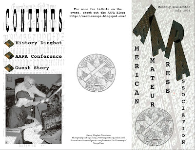
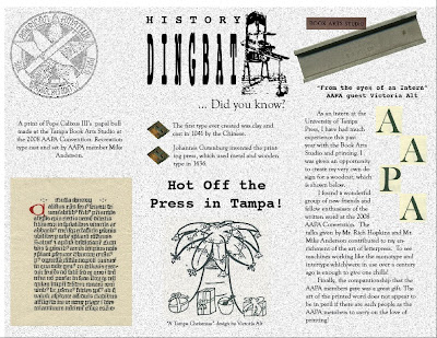
Instead of making a food menu, I decided to create a newsletter. On June 13th, I attended and worked at the AAPA (American Amateur Printing Association) Convention held here in Tampa. As a student staff assistant at the University of Tampa Press, I helped the convention run smoothly while also learning a great deal about the art of letterpress printing. The group is currently creating a post-convention newsletter, so I thought I would create my own! The main page is first, with a background for texture. Inside, I balanced scanned images from the convention with text and logos. The front incorporates a few different textured backgrounds: the contents page is a typographic recreation of Gutenburg's type and the other is of an entire font type. It turned out well, and perhaps the other AAPA members will agree :-)
Wednesday, June 18, 2008
Maximal Poem
Thursday, June 12, 2008
Personal Logos
Here are my five logos in a non-transparency GIF. The first two and last ones-- travel agent, editor of a press, and Tolkien scholar-- are some of my dream jobs for which I've created corresponding business cards. The two Red Button Press cards are ones which I might possibly use one day. My friend and I are hoping to one day run an independent, non-profit publishing company which would be christened "Red Button Press" based upon an inside story.
The two enhanced photographs (2nd card and last card) were taken by me, and I used live trace and shading to give them a faded and more interesting look. Otherwise, I used a lot of symbols, brush strokes and shapes. Interesting results!
Skyline Logo Transformation
This is a logo from one of my favorite restaurants in my hometown. (Original on top)
After tracing using the pen tool, I converted the points of both the "Skyline" and the actual background skyline to pull the edges and transform them, giving the original logo a more edgy look. The "chili" was typed in and set in front of a red rectangle. Overall, the look has a sharper, more modern look.
Wednesday, June 11, 2008
Revised poster
I really like this version of my Sandra Cisneros quote better, not only because it can be seen and understood better from far away but also the black and white is much more elegant. In addition, it helps the red in "love" stand out even more. While the background picture could not be live traced any better, I think that the somewhat water-color-looking effect it has works well.
Calligramme
This is a poster created by my favorite John Donne poem "The Sun Rising". It took far longer than it probably should have, so enjoy. :-)
The Sun Rising: John Donne
Busy old fool, unruly sun.
Why dost thou thus
Through windows and through curtains call on us?
Must to thy motions lovers' seasons run?
Saucy pedantic wretch, go chide
Late schoolboys and sour prentices
Go tell court huntsmen that the king will ride
Call country ants to harvest offices;
Love, all alike, no season knows nor clime,
Nor hours, days, months, which are the rags of time.
Thy beams, reverend and strong
Why shouldst thou think?
I could eclipse and cloud them with a wink
But that I would not lose her sight so long;
If her eyes have not blinded thine
Look, and tomorrow late, tell me
Whether both the Indias of spice and mine
Be where thou lefst them, or lie here with me.
Ask for those kings whom thou saw'st yesterday
And thou shalt hear, All here in one bed lay.
She is all states, and all princes I
Nothing else is.
Princes do buy play us; compared to this
All honor's mimic, all wealth alchemy.
Thou sun art half as happy as we
In that the world's contracted thus;
Thine age asks ease, and since thy duties be
To warm the world, that's done in warming us.
Shine here to us, and thou art everywhere;
This bed thy center is, these walls thy sphere.
Illustrator Training Videos
http://movielibrary.lynda.com/html/modPage.asp?ID=351
The supplemental training videos are interesting, but in lieu of our actual classwork seem to drag a bit and are a little redundant. I know basically what is being demonstrated in the videos provided because we learned them in class, but they are helpful to find alternate ways or shortcuts to doing these simpler tasks. For example, the "Navigating within a document" was helpful to find a quicker way to go from a more focused portion of the page directly out to the full screen (double click the grab tool). I also found the "Welcome Screen" and "Exploring panels and workspaces" to be useful as well.
Tuesday, June 10, 2008
Poster 2
In this poster, I tried to incorporate a riddle into the theme to make it more fun. I also used some images from my home to enhance the cheesiness. I used many layers and different live traces for each image. I also altered the Bengals logo and used the pen tool to trace the image of the corn. Betcha don't know the answer...
Monday, June 9, 2008
First Poster
For my first poster, I wanted to combine a funky look with a common phrase. After cropping this picture of myself in Photoshop, I used the grayscale vector tracing and faded black live paint to give it a liquid silver effect. I made the background transparent so that it would stand out better on a t-shirt or poster.
Wednesday, June 4, 2008
Autoscopy Art GIF 3
More GIFs
#1: Compression adaptive 4 color with low dither @ 12.07 K. Textures look cool.
#2: Compression adaptive 8 color with high dither @ 98.73 K. Crazy how much heavier it is, though the few extra blue hues accentuate the eye, and the high dither gives the sharper edges around the eye and at the book pages a great look.
#3: Compression B/W with low dither @ 5.38 K. Reeeeeally neat how the entire idea of the image (face, horse and book) is completely distorted, and now it looks like some kind of monster.
#4: Compression grayscale with medium dither @ 86.19 K. Looks cool.
Autoscopy Art GIF 2
Some neat x-ray looking effects.
#1: Compression adaptive 2 color with high dither @ 7.91 K. I like how the face is almost gone.
#2: Compression B/W with very high dither @ 12.87 K.
#3: Compression restricted 8 color (?) with low dither @ 25.64 K. Cool colors.
#4: Compression selective 16 color with low dither @ 22.13 K.
Autoscopy Art GIF 1
For these GIF images, I have experimented with some different colors and measurements of dither. The descriptions are as follows:
#1: This compression is Restricted with 16 colors and a rather high dither @ 29.59 K.
#2: Compression B/W with a very low dither @ 7.17 K. I particularly enjoy the contrast, and the absence of blemishes-- quite flattering!
#3: Compression grayscale with a mid-way dither @ 81.62 K. Very neat result.
#4: Compression custom with diffusion and a very low dither @ 32 K. Only 16 colors.
Autoscopy Art 3
This piece represents the pastimes which make up who I am. By blending and texturing hair with brush strokes and book pages, I've incorporated my loves of horses, reading, writing, and imagination into this image.
The compression values are as follows (at 400 pixel height):
#1: JPG with 0% Quality @ 14.25 K.
#2: JPG with 25% Quality @ 23.16 K.
#3: JPG with 75% Quality @ 58.75 K.
#4: JPG with 100% Quality @ 130.1 K.
Autoscopy Art 2
This autoscophy represents a period of my life which defines me in which I was diagnosed with all of the diseases/syndromes that are listed on the image, leading to the removal of my right lung and a subsequent correctional surgery. Now, in ascending order, this image is done as follows, all at 4 inches high:
#1: JPG with 0% Quality @ 11.39 K
#2: JPG with 25% Quality @ 17.89 K
#3: JPG with 75% Quality @ 47.1 K
#4: JPG with 100% Quality @ 111.1 K
Autoscopy Art
This autoscopy (though cheesy) represents my life post-graduation. While using different blending options and brush strokes, I have here compressed it to be a 400 pixel high JPG with 100% Quality and weighs 139.3 K.
The second compression is a JPG with 75% Quality at 61.59K.
The third is 25% Quality at 23.32 K.
Finally, the last image is 0 Quality and weighs 14.38 K.
Monday, June 2, 2008
ASCII Art
Subscribe to:
Posts (Atom)